Winning Colors for an Entrance Foyer
May 26, 2011
If you own a television, chances are you’ve seen the Kohler faucet commercial, where a well-heeled client plunks a trendsetting faucet onto her architect’s desk and suggests: “Design a house around this.” It’s not as far fetched an idea as you might think. Let’s suppose the thing being plunked onto a desk was a paint color. What to do? Designers might identify any color that an entire palette is planned around as a “bridge” color. In general, color experts assign the word “core,” to a single hue that links a palette together. I chose to work my whole house color palette around the winning combination of black+white. An ambitious choice for a bridge color? Take a look!
“Bridge” is an accurate description for any color which will unify a palette. A good bridge color will link differing hues together and act as a buffer between even seemingly incompatible color combinations. Since maintaining a pleasing flow of color from room to room makes sense, it’s equally sensible to link your color transitions together with any single repetitive hue. Unlike a neutral color, an ambiguous color is generally much more complex. When in doubt, remember that any color that’s hard to describe or name is likely to be an ambiguous color. Here are some of the hard to describe darlings of ambiguity:
If you have a beautiful room that falls a little flat, the addition an ambiguous bridge color will solidify the color scheme and add weight or ground the palette. Beyond that, repeating an ambiguous color selection throughout a house is the easiest trick to I know to maintain the flow of color from room to room while harmonizing the color scheme overall. Test this concept in any room where the color choice appears tentative, especially a room that feels a little boring or blah, and you’ll see how powerful the repetition of a weighty color can be! The theory is simple–a good bridge color adds interest and balance to a colorful palette and, more importantly, advances the entire palette overall. How will I add black+white to six rooms without having my house appear a poor interpretation of a vintage Chanel suit? Easy–a combination of re-interpreted, classic, black+white finishes and a few enhancements to my existing black+white influences.
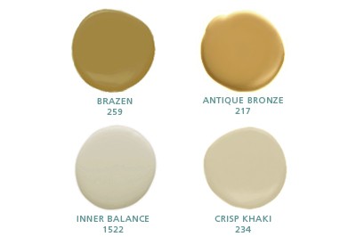
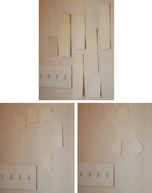
I had to battle my love of crisp white trim and the need for a warmer, creamy white, to compliment the existing strie. Choosing any color is always a process of elimination. Once I taped up each shade of white I was considering, I forced myself to eliminate my usual favorites–Paradise Beach 911, which is too pink, and Palace White 956, which is too grey.
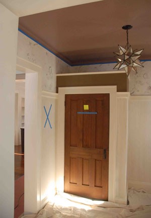
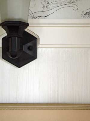
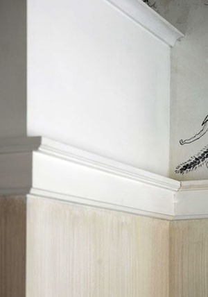
I looked at the chips in the daylight and at night and, knowing the purple ceiling would influence the white hues, I waited until the ceiling was finished too. One by one, I eliminated. Using scissors, I unceremoniously cut the chips to the beat of my opinions; too grey, too yellow, too white; snip, snip, snip. Finally, I arrived at a perfectly creamy beige, which is a near exact match to the existing strie combination. Refining the contrast of the trim color, to a near straight match to the wall finish, expands the wall perimeter. Each door is framed by 3 inches or more of trim on either side; 8 x 3 = 24 inches. It’s subtle, but I gained over two feet of consistent perimeter wall by virtue of my balanced trim color. This is one sure way to make a space feel larger–reduce the surrounding trim color contrast.
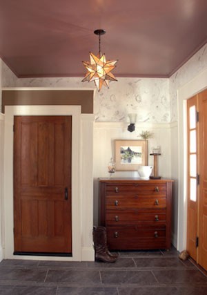
My final color tweak in the foyer begins to answer the call for must-have furnishings, and all the plain-old stuff a functional entry foyer, needs to have. Besides adding some heft to the diminutive nature of the salvaged closet door, the tiny band of spicy, nearly green, brown, (Buckthorn 987) will lend it’s cooperative nature to brass and wood surfaces elsewhere in the house. It will also be a great ally to me when I begin the hunt for a super practical area rug that can withstand the perils of muddy boots. Surely a trip to West Elm is in order? I have many options for a rug now, which is good, because most color pros would suggest selecting the rug before painting the walls! Ah, we’re learning how to be brave colorists around here aren’t we?
The foyer still needs a dazzling mirror, something high gloss to take the “grandma” away and a chair. For right now, I’m mesmerized by the Bonne Nuit, and thrilled I was able to enhance the big color winner in the room–the black+white wall finish. Contact DJ’s Painting today to get some new color in your home.
Re-Blogged From http://livingincolorwithsonu.typepad.com/sonu_blog/2011/04/winning-colors-for-an-entrance-foyer.html
DJ's Painting can offer your facility more than just industrial painting. DJ's Painting can offer systems that will keep hot surfaces cool to the touch, saving energy costs for your business. Contact DJ's Painting today to find out about this system and other options like floor coatings to have your facility running and looking its best.
We are certified applicators of the concrete protector floor coating systems known as the Perma-flex system. We also work with several other manufacturers of standard high-quality epoxy and urethane floor coatings and stains. Whether you need garage door coatings or coated shop floors, we have what you need.
DJ's Painting has been South Jersey's home painter since 1986. Having painted thousands of homes in New Jersey including log cabin staining, DJ's Painting is the only choice when you want your home to look brand new again. We have the experience needed to get the job done right on every house painting project.