Integrating Brand Colors into Office Design: A Strategy for Identity and Professionalism
January 8, 2025
In the modern business landscape, where every interaction counts, your office space is not just a place of work but a physical manifestation of your brand’s identity. Integrating your brand colors into your office design can subtly or boldly communicate your company culture, values, and personality. Here’s how companies can do this effectively, ensuring the space remains professional yet vibrant with brand identity.
Understanding Brand Colors
Before diving into design, it’s crucial to understand what your brand colors represent. Are they bold and dynamic, conveying innovation and energy, or are they calm and sophisticated, suggesting reliability and professionalism? This understanding will guide how and where these colors are applied.
Bold and Dynamic Colors
Characteristics:
- Vibrant: These colors are eye-catching and can energize a space.
- Innovative: Often associated with creativity, technology, and forward-thinking.
- Energetic: They convey a sense of urgency, action, and motivation.
Examples:
- Red: Symbolizes passion, excitement, and urgency. It can be very stimulating, often used in spaces where high energy or quick decision-making is needed.
- Bright Yellow: Represents optimism, cheerfulness, and creativity. Ideal for environments that aim to foster innovative thinking or a positive, welcoming atmosphere.
- Electric Blue: Often used to signify trust, but in its brighter forms, it can also denote innovation and forward momentum, perfect for tech or creative industries.
- Orange: Combines the energy of red and the happiness of yellow, suggesting warmth, enthusiasm, and fun, which can be great for collaborative or brainstorming areas.
- Neon Green: Conveys growth, health, and renewal but in its more vibrant forms can be used to highlight areas of innovation or eco-friendliness.
Application in Office Design:
- Use these colors for accent walls in creative or meeting spaces.
- Furniture or decor in these colors can energize common areas or break rooms.
- Bold colors can be used in digital displays or interactive elements to engage and motivate.
Calm and Sophisticated Colors
Characteristics:
- Subtle: These colors are understated, promoting a sense of peace and professionalism.
- Reliable: They suggest stability, trust, and professionalism.
- Elegant: Often used to convey luxury, quality, or a traditional business environment.
Examples:
- Navy Blue: Implies depth, reliability, and intelligence, often used in corporate environments to convey a sense of security and professionalism.
- Soft Gray: Represents neutrality, balance, and sophistication. It’s versatile and can be used to create a calm, focused working environment.
- Beige or Taupe: These earthy tones suggest warmth and timelessness, ideal for creating a welcoming yet professional atmosphere.
- Muted Green: Suggests tranquility, growth, and sustainability in a more subdued, professional manner.
- Deep Purple: Can convey luxury, creativity, and wisdom when used in its more muted forms, suitable for executive areas or creative spaces needing a touch of elegance.
Application in Office Design:
- These colors are perfect for the majority of wall spaces or as a base color palette for the entire office to ensure a professional, focused work environment.
- Use in areas where concentration is key, like individual workstations or quiet zones.
- Accents in these colors can be in higher-end furniture pieces or decor to add sophistication without overpowering the space.
Balancing Both:
In practice, many offices will use a mix of bold and calm colors to balance energy with professionalism. In main areas like a lobby or hallway, it is common practice to shoot for calmer, sophisticated colors, providing a serene backdrop. These soft tones can be accented in areas of innovation and creativity like conference rooms. By adding in bold colors either on the walls, in the furniture or in the floors it can draw amused attention but still not distract.
Subtle Integration
- Accent Walls:
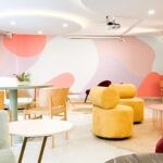
- Use your brand colors for one or two accent walls in common areas like reception, meeting rooms, or break areas. This not only highlights your brand but also breaks the monotony of neutral spaces without overwhelming.
- Furniture and Fixtures:
- Choose office furniture, like chairs, sofas, or desks, in your brand colors. This approach is less invasive but still impactful, especially in areas where people gather.
- Decorative Elements:
- Incorporate brand colors through art, plants’ pots, throw pillows, or even custom lighting. These elements add color without dominating the space.
- Flooring:
- If going for subtlety, consider area rugs or carpet tiles in brand colors for specific zones. This can define spaces like collaboration areas or quiet work zones.
Bold Statements
- Full Color Schemes:
- For companies with a strong visual identity, consider painting larger areas or even entire floors in your brand colors. This approach is perfect for creative industries or startups wanting to make a statement.
- Brand Murals:
- Commission a mural that incorporates your logo or brand elements. This can be in a central location like a lobby or a creative hub, making a dramatic and memorable impression.
Balancing Professionalism with Brand Identity
- Neutral Base: Start with a neutral color palette for walls and flooring. This provides a canvas that won’t feel overwhelming with the addition of brand colors.
- Consistency: Ensure that the use of color is consistent throughout the office. This doesn’t mean every room needs to be the same, but there should be a cohesive thread.
- Functionality: Consider how colors affect productivity and mood. Warmer colors might energize but could be too stimulating for long work sessions. Balance is key.
- Employee Input: Sometimes, involving employees in smaller design decisions can make the space feel more like a shared home, boosting morale while aligning with brand identity.
- Flexibility: Office spaces evolve; ensure that the color integration allows for future changes without a complete overhaul. Modular furniture or easily repaintable surfaces can be beneficial.
Conclusion
This approach not only reinforces brand identity but also caters to the functional needs of different spaces within the office, ensuring that the environment supports the company’s culture and operational goals.
Works Cited
“Integrating Brand Identity Into Workspace Design | OP Group.” Office Principles.
officeprinciples.com. Published: 2024-06-04 06:07 PDT.
“5 Ways to Incorporate your Brand into Office Design – RI.” RI Workplace. riworkplace.com.
Published: 2017-04-24 10:37 PDT.
“Branding with Colour: How to Incorporate Company Identity into Office Design.” LinkedIn.
www.linkedin.com. Published: 2023-09-17 21:34 PDT.
“Interior Design Beyond Company Visual Guidelines and Brand.” Space Refinery.
www.spacerefinery.com. Published: 2024-04-30 13:58 PDT.
“Color and brands are all about identity!” Grapheine. www.grapheine.com. Published:
2022-09-28 03:39 PDT.
“Color Psychology in Retail Design: From Establishing Brand Identity to Influencing
Customer Behavior.” ArchDaily. www.archdaily.com. Published: 2023-08-14 00:30
PDT.
“Enhancing Company Branding Through Office Color Schemes.” Coalesse.
www.coalesse.com. Published: 2016-11-20 16:00 PST.
“Color Psychology in Business and Marketing | Shutterstock.” Shutterstock.
www.shutterstock.com. Published: 2023-03-15 08:22 PDT.
“The Color Wheel: A Comprehensive Guide for Interior Designers – Essential Home.”
Essential Home. www.essentialhome.eu. Published: 2020-05-28 14:20 PDT.
“Psychology of Color in Marketing and Branding.” 99designs. 99designs.com. Published:
2024-02-29 12:47 PST.
“How to Choose the Perfect Brand Colors: A Comprehensive Guide – Looka.” Looka.
looka.com. Published: 2022-07-27 13:20 PDT.
“Color and Meaning in Business Branding – CityGro.” CityGro. citygro.com. Published:
2014-11-19 06:00 PST.
“What Brand Colors Can Reveal About Your Business – Business Adobe.” Adobe.
business.adobe.com.
“The Psychology Behind Logo Colors – DesignRush.” DesignRush. www.designrush.com.
Published: 2022-10-10 04:00 PDT.
DJ's Painting can offer your facility more than just industrial painting. DJ's Painting can offer systems that will keep hot surfaces cool to the touch, saving energy costs for your business. Contact DJ's Painting today to find out about this system and other options like floor coatings to have your facility running and looking its best.
We are certified applicators of the concrete protector floor coating systems known as the Perma-flex system. We also work with several other manufacturers of standard high-quality epoxy and urethane floor coatings and stains. Whether you need garage door coatings or coated shop floors, we have what you need.
DJ's Painting has been South Jersey's home painter since 1986. Having painted thousands of homes in New Jersey including log cabin staining, DJ's Painting is the only choice when you want your home to look brand new again. We have the experience needed to get the job done right on every house painting project.


